Earlier this year, a botched FAFSA rollout saw a 9% drop in first-time applicants, about 432,000 fewer overall applications. FASFA ramped up call center support, but also made key changes to the form to make it easier to navigate for students. Here’s what we’ve learned from the changes.
1. Multi-Step Sections for Better Flow
The new FAFSA has adopted a more streamlined, multi-step approach to make the process feel less long and overwhelming. Applying this principle to your forms helps break down complex tasks, guiding users step-by-step. This improves user engagement and prevents form abandonment.

2. Clear, Concise Language
FAFSA replaces “parent” or “parents/guardians” with the term “contributor” to better clarify financial data responsibilities, especially for non-traditional family structures. This change highlights the importance of using clear and straightforward language in web forms. By keeping instructions simple and easy to understand, you can help prevent confusion and ensure users know exactly what is expected, leading to an improved form-filling experience.

3. Sensitive Data and Privacy Considerations
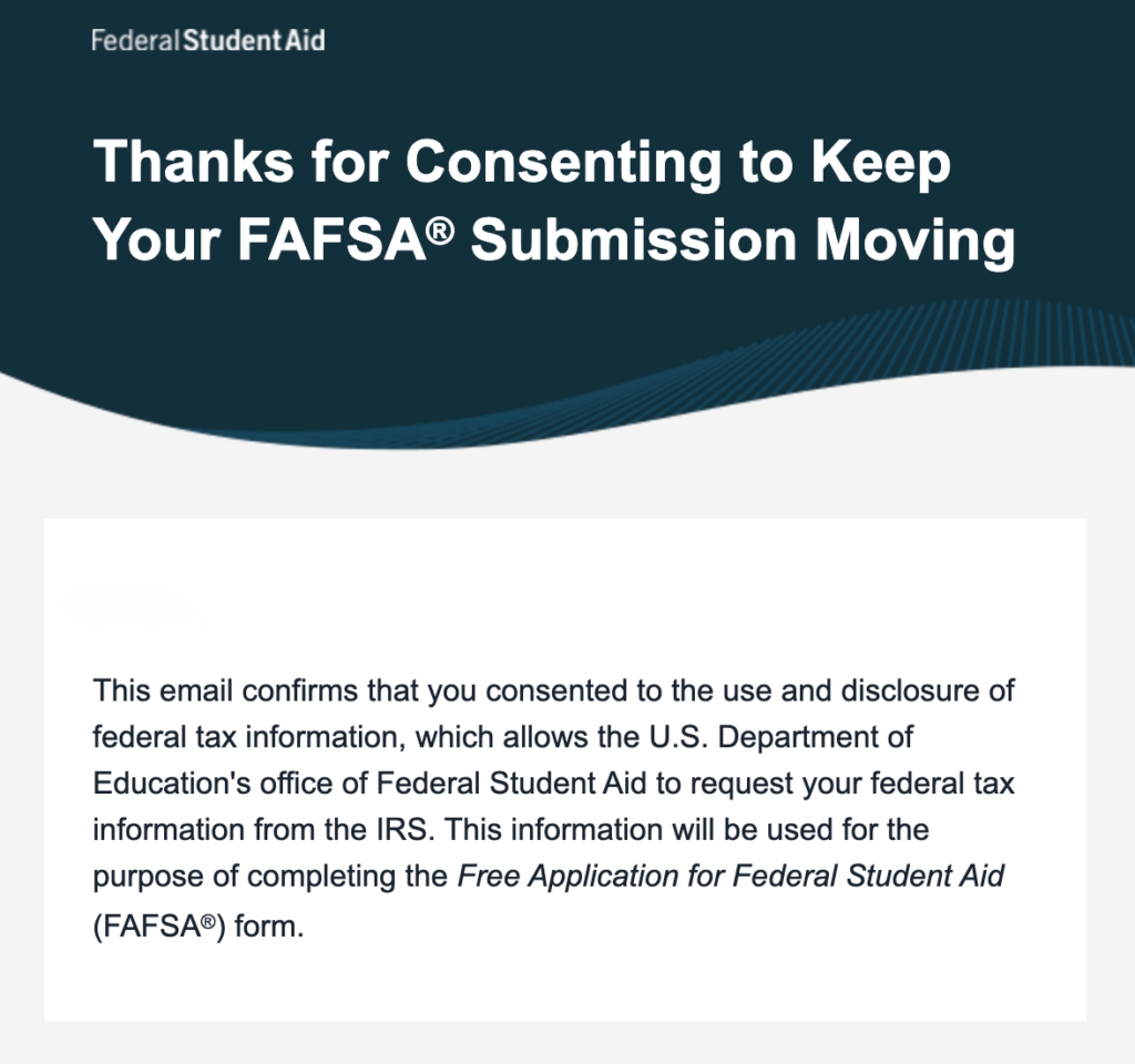
The FAFSA’s updated data consent process, requiring explicit approval for IRS data sharing, offers a strong lesson in handling sensitive information. When dealing with private data, always prioritize privacy and transparency. Ask for only necessary data and ensure users understand how their information will be used and protected.
Under FERPA, prior written consent from an eligible student to disclose FAFSA data must be signed and dated and specify the records that may be disclosed and the purpose of the disclosure and must also identify the party or class of parties to whom the disclosure may be made. (34 CFR § 99.30 (a) and (b)).
4. Improve Usability with Intuitive Design
The new requirement for StudentAid.gov accounts for both students and contributors highlights the importance of intuitive user journeys. Make your forms easy to navigate by minimizing the number of fields, using progress bars, and including help text and tooltips that expand on questions and definitions. This ensures users are not overwhelmed by lengthy or confusing forms.

5. Ensure Accessibility for All Users
The FAFSA updates show a commitment to expanding access to more students, including those with disabilities. Forms should follow accessibility guidelines, such as ensuring compatibility with screen readers and providing alternative text for images. Always test your forms with users from diverse backgrounds to identify potential barriers.
6. Feedback and Progress Updates
The shift from a Student Aid Report (SAR) to a FAFSA Submission Summary provides users with real-time feedback on their submissions. This principle can be applied to any form by delivering immediate, contextual feedback during the process. Let users know when they’ve successfully completed sections or if they need to make corrections.

7. Importance of Language and Structure: Addressing Homelessness
FAFSA changes move homelessness into a separate, clearly defined question, rather than grouping it with “other circumstances.” This language change eliminates ambiguity and reduces stigma, allowing students in need to self-identify more easily. For form builders, this shift demonstrates how simple, thoughtful language adjustments can enhance accessibility and create a more welcoming environment for users, improving both usability and user confidence.

8. Seamless Integration with External Systems
FAFSA’s integration with the IRS is a prime example of using external data to simplify form completion. If your web form integrates with third-party systems (like CRMs or payment processors), ensure the process is seamless, and clearly communicate to users how their data will be retrieved.
Conclusion
The latest FAFSA changes offer a blueprint for improving form design, focusing on clarity, accessibility, and user experience. By incorporating multi-step processes, clear language, robust security measures, and user feedback, you can create web forms that are both functional and user-friendly. Implementing these lessons will not only enhance the efficiency of your forms but also foster trust and reduce friction for your users.
Want more tips on designing forms that improve user experience and have higher completion rates? Check out FormAssembly’s Ultimate Guide to Form Best Practices or book a demo for 1:1 feedback for home to improve your outcomes.