When it comes to optimizing forms for higher conversion rates, personalization is key.
Tailored forms don’t just improve user experience—they can significantly boost your conversion rates. Research shows that personalized forms can increase form submissions by up to 40%. Whether you’re collecting leads, processing orders, or gathering customer feedback, customizing your forms to align with each user’s journey can make a world of difference.
In this post, we’ll walk through 7 actionable tips, data-backed insights, and real-world examples to show you how personalized forms can drive conversions for your business.
Why Personalized Forms Matter: The Problem with Generic Forms
Generic forms often lead to poor user experiences. A “one-size-fits-all” approach can be frustrating, especially when users are asked irrelevant or excessive questions. According to HubSpot, 68% of users abandon forms because of their complexity, length, or irrelevant content. This abandonment can be minimized with personalized forms that adapt based on the user’s responses and journey.
Your first impression isn’t just about looks—it’s about how users feel when they engage with your brand. Personalized forms don’t just look better—they improve outcomes. Here are 7 ways to personalize your forms, reduce friction, and maximize conversions.
1. Use Conditional Logic to Personalize Form Fields
Personalized Experience Through Logic
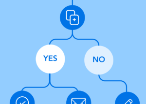
Conditional logic allows you to adjust form fields based on user inputs. For example, if a user selects “Yes” to a question asking if they are interested in a product, you can trigger additional questions to gather more specific details. This dynamic flow makes the form feel more tailored and relevant to the user’s needs.
Why It Works
Personalized forms with conditional logic have been shown to increase form completion rates by up to 35% (source: HubSpot). Users appreciate forms that are specifically tailored to them, leading to fewer abandoned forms and more successful submissions.
Example
If your marketing campaign targets users over 18, you can set up conditional questions that display the next step only to those who confirm their age. Use conditionally triggered sections in your forms to ensure you’re engaging the right audience and streamlining the experience for qualified leads.
Visualize It
Here’s what that looks like within the FormAssembly form builder.

Using conditional logic enhances the user experience and boosts marketing results by tailoring the form journey. For example, if you know a user’s location, you can automatically adjust options or provide region-specific content, making the form process smoother and more relevant.
By reducing friction in this way, conditional logic helps increase form completions and makes interactions more meaningful, ultimately strengthening your campaign’s effectiveness.

2. Keep Forms Short and Relevant
The Power of Simplification
Long, complicated forms are one of the biggest barriers to form completion. The more fields you require users to fill out, the more likely they are to abandon the form. Personalization is key here—by streamlining your forms to ask only the most essential questions up front, you can increase the chances of completion and provide a better user experience.
Why It Works
Research by HubSpot shows that reducing the number of fields in a form by just one can increase conversion rates by up to 50%. By cutting out unnecessary fields and focusing only on what you truly need, you’re making the experience less intimidating and more user-friendly.
Example
Let’s say you’re offering a whitepaper download as a lead magnet. Instead of asking for the user’s full address, job title, or company size right away, just ask for their name and email address. Once the user has submitted the form and engaged with your content, you can follow up with a secondary form or survey to gather more detailed information, such as their industry or company size.
What to Do if You Need a Longer Form
If your form must be longer, you can still make it feel shorter by breaking it up into multiple steps. Multi-step forms are far less overwhelming than a single long form. By breaking down your questions into digestible chunks, you can guide users through the process in a way that feels more manageable. Plus, users are less likely to get frustrated or abandon the process if they feel they’re making steady progress.
Visualize It
See how Airbnb does it when gathering large amounts of information:

3. Implement Real-Time Inline Validation
Reducing Frustration and Improving Accuracy
Inline validation gives users immediate feedback if they enter data incorrectly. When users make mistakes, they often abandon the form out of frustration. Real-time validation ensures that users receive instant feedback, reducing errors and increasing form completion.
Why It Works
Forms with inline validation have been shown to reduce abandonment rates by 22% and improve user satisfaction by 31% (source: Nielsen Norman Group). This feature is especially helpful for preventing errors in email addresses, phone numbers, and other key fields.
Example
When a user types a commonly misspelled name, like Jhn, an inline validation message such as “Did you mean John?” helps guide them to the correct information in the field without needing to get to the end of the form.
Visualize It
Inline validation offers real-time feedback right within the field where an error occurs, allowing users to make adjustments as they go. This prevents the frustration of reaching the end of a form only to encounter multiple errors at once.

4. Offer Social Logins to Speed Up Form Filling
Streamline the Process with Social Accounts
By allowing users to log in via social media accounts like Google, Facebook, or LinkedIn, you eliminate the need for them to re-enter personal information. This saves time and reduces friction, making it easier for users to complete your forms.
Why It Works
According to Janrain, social logins can increase conversion rates by up to 50% by reducing friction and improving the speed of form submissions. Users are more likely to convert when they don’t need to create new passwords or fill out lengthy registration forms.
Example
A potential client can simply click “Sign Up with Google” to automatically populate their name, email, and other relevant information, allowing them to proceed quickly through the form.
Visualize It

Social login buttons prominently displayed, offer users a quicker way to complete their information.
5. Personalize the Language and Tone of Your Form
Make Users Feel at Home with Custom Copy
Personalization isn’t just about dynamic fields—it’s also about how you speak to your users ( and I’m not talking about localization, which deserves its own blog). If your form copy resonates with the user’s expectations and tone, they’re more likely to engage. For example, use a friendly tone for community-related forms and a more professional tone for B2B forms.
Why It Works
According to the Content Marketing Institute, personalized language can boost customer loyalty by 60%. Personalizing form copy to fit the context can make your form feel more approachable and less transactional. Whenever you can prefill a form, you absolutely should.
Example
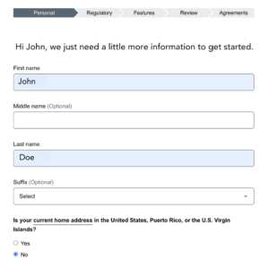
Instead of a generic “Please enter your email,” consider something like, “Hi [Name], we’d love to keep you updated with news and offers. Please enter your email.”
Visualize It
6. Use Progress Bars for Longer Forms
Give Users Visibility on Their Progress
When users can see how far they’ve come, they’re more likely to finish. A progress bar is a great way to provide visual cues, especially in multi-step forms. It keeps users informed about how much longer they need to complete the process.
Why It Works
Research by Nielsen Norman Group shows that users are more likely to complete multi-step forms if they can see their progress. A visible progress bar improves user engagement by showing that they’re close to completion, which reduces anxiety about long forms.
Example
For a multi-step survey form, you can display a progress bar indicating that users are almost halfway done with their survey.
Visualize It

Check out this 2-minute video on how to add a progress bar to your forms using FormAssembly
7. Case Study: Personalized Forms in Action
Let’s take a look at how one company applied these strategies and saw measurable results.
Life Education AU, a nonprofit wanted to expand their pool of grant applicants. By making several of the changes we’ve discussed in this blog, they saw a 35% increase in grant applications. With conditional processing and personalization, the application form dynamically adjusts to create a tailored experience, drawing from over 70 qualitative and quantitative questions to fit each user’s needs.
Ready to Personalize Your Forms?
Personalizing your forms is not just a “nice to have”— it changes your outcomes.
Improve user engagement, reduce abandonment, and increase conversion rates by incorporating strategies like conditional logic, simplified form fields, inline validation, and social logins, you can significantly enhance your forms’ effectiveness and user experience.
If you’re ready to take your forms to the next level, start experimenting with these personalization techniques in your FormAssembly forms today. Track user behavior and optimize based on data, ensuring your forms are performing at their peak.
